SF4 arcade stick custom art
Today I started working on a new project: customizing my Street Fighter 4 TE arcade stick! At this point, I am only focusing on creating some custom artwork. In the future, I may possibly go beyond that and upgrade the joystick and buttons. But baby steps first…
Here are 2 SNSD designs that I made featuring Taeyeon, the leader of the group. I would really appreciate some feedback as to which one you like better, as I’m having a hard time deciding which one to finalize and print.
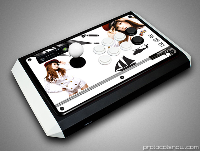
To make this custom stick a reality, I will be enlisting the services of ArtHong’s store, both to print the artwork for me as well as to provide the plexiglass coverslip replacing the stock plastic on the TE stick. He has a lot of information on his site in case you’re interested in reading more about how to customize your arcade stick. In particular, his Photoshop art templates are a good resource to help you get started. Also, Likkuid’s template is an easy way to create mock-ups of the stick with your art to get a better sense of what the finished product will look like.
Here are my two designs:
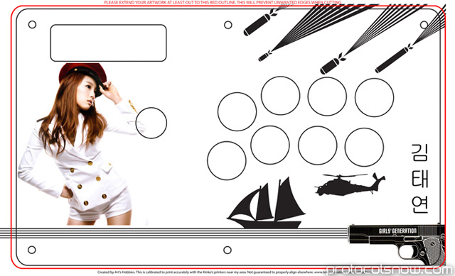
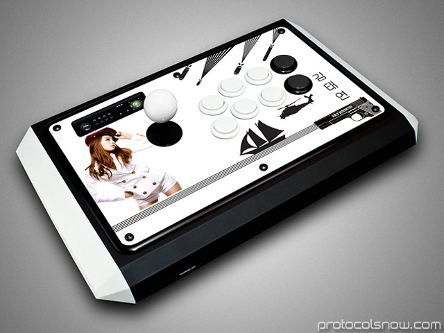
#1 — This one has a lot of white space and feels quite plain to me, but it’s clean and simple. I like the flow of this design with all the military weapons on the right half facing the same direction.
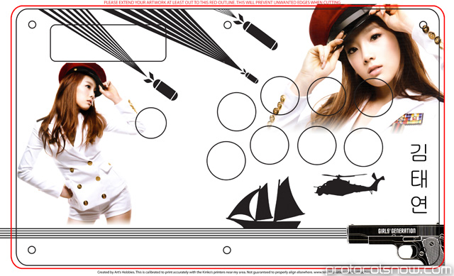

#2 — I really wanted to fit these two photos of Taeyeon into my design somehow, but it was tricky to squeeze them in without a photo being butchered by the buttons. This was the best arrangement I came up with. My first impression was that the layout is messy, particularly when viewing the head-on template image. However, the 3D mock-up looks a lot better, which is why it’s important to have a simulation of the final product.
I’ve asked a few people about their opinion and everybody prefers #2. Do you have any suggestions? I’m leaning towards #2 as well but I’m still torn. I may end up printing both designs.
